
Original Cover Design
- Sleeve 019/100: All Rights Removed (2011)
- Studio Album by Airbag
- Label: Karisma Records
- Genre: Neo-Prog/ Prog Rock
- Original Cover: Artwork by Frédéric Peynet with design by Asle Tostrup
Sleeve #19 for my project #100albumsleeves 😱 we are so close to the first quarter!.
I was listening to David Gilmour last week so it felt natural to keep going with the progressive music vibes. One of the bands I was listening to was Airbag. Their song “Homesick” gives me goosebumps every time, so it was a no-brainer to go with that album next.
I’m not a mega fan of the vocals, but the music and the lyrics are so good I forget about that. Most of the songs are long and instrumental anyway hehehe.
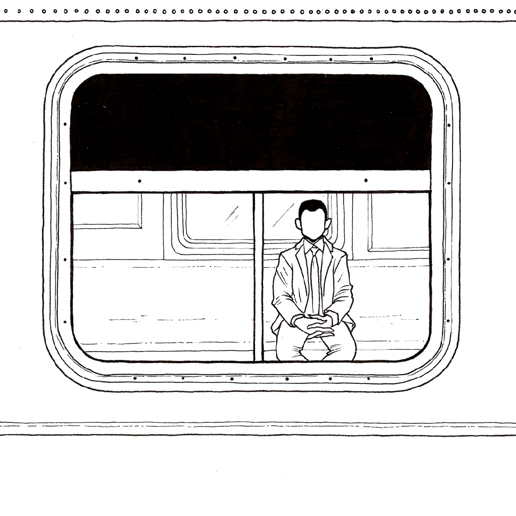
Through the lyrics, I understood the album talks about the feeling of loneliness that comes from urban life and living just under the terms of society. I pictured a salaryman in a metro subway feeling invisible and unspecial among the crowd.
I have to mention I like the original cover a lot, and that I wouldn’t change it a bit (my proposal is just a fanart inspired by the music). It shows a salaryman committing suicide by jumping off a bridge. But if we look closer, the man is not a man but a shark, so if there’s water under the bridge maybe he’s just coming home, to whatever he really is. Or maybe he’s a predator and has a lot of reasons to feel guilty and commit suicide. I don’t really know the meaning of the original cover, but either way, I think it is genius.

Album Cover Redesign by franzmori. This is fan art, no copyright infringement intended.


Looking to my cover, one could assume it is a Hip-Hop or R&B album instead of Prog Rock😅 I noticed this in one of my final explorations where I had made the name of the band in a graffitti font painted in the train wall.
I later decided to play with how the wall of the metro looked and turn it into a universe, but that removed the focus away from the salaryman and gave a more optimistic vibe. In the end, I settled with my first version and only changed the font of the band name to something more subtle. See the GIF below to get the idea.
Part of the process of this design
Would you like your own Album Cover design?
I’m available for commissions!
Listen to the art! I’ll be adding a new album each week to this Spotify playlist HERE.
To know more about my personal project and see the rest of the cover designs in this series, go HERE.